When we last left off, The Virginia Beer Company had taken a break from developing our logo as we turned our attention to other pressing aspects of starting this business: finding a location, raising capital, hiring a brewmaster, recipe development, etc. We received some amazing design concepts in 2013 from a graphic artist at Sarah Peng Design, but realized that as we focused our energy on developing a brand, we still didn’t know exactly what that brand was supposed to represent. We knew we were opening a brewery with a taproom and beer garden in Williamsburg, VA. We knew we would be called The Virginia Beer Company. And we knew we wanted to brew a lot of beers – to specialize in variety, as it were! But recipe development was still an ongoing (and awesome) endeavour. Our site search was in Round 2 of what would eventually be a three round bout. And our future brewmaster was still in Atlanta, making it difficult to define a brand without a core component of that brand available to participate in the discussions. Essentially we had gotten ahead of ourselves on the artistic side, and so turned our attentions in early 2014 to establishing our business in Williamsburg before committing to defining and expanding the brand any further.
As it would turn out, the focus on Williamsburg was exactly what was needed to refine our brand in the early stages of ’14. The original concept for our logo was developed by a William & Mary student with a talent for visual design, and that initial scope was focused on our W&M roots. We then turned to a more seasoned artist for new variations in 2013, and as luck would have it we would next turn to a seasoned artist who also happened to be a Williamsburg resident for 2014’s branding direction. We had the fortune of being introduced to Abigail Darrin, who had already done concept work for Williamsburg restaurants such as DoG Street Pub and Blue Talon Bistro (visit Abigail’s website to check out her awesome portfolio!).
As we continued to spend time in Williamsburg, promoting our ideas and meeting others in the food and beverage industry, we were introduced to Abigail, who was not a W&M alum. This afforded her the ability to consider imagery and styles that were relevant to Williamsburg but not specifically centric to campus life. Since Chris and I met at W&M and had spent much time volunteering for the College after graduation, we admitted that our ideas for building a brand often times had blinders focused on pride for the Tribe. In our eyes this wasn’t necessarily a bad thing, but with a surprising number of W&M alums already working in the Virginia brewing industry, and green & gold logos at the time already promoted at Center of the Universe Brewing Co., we determined that at least to an extent: we needed a push past the Wren.
Our new artist had experience working in the food and beverage industry, and as a Williamsburg resident was familiar with the surrounding area. We had a number of meetings to discuss our wants – what we saw as powerful tools for building a brewery brand – and to discuss where we were struggling to come up with a unique spin on a straight forward name like The Virginia Beer Company. The first area where we changed focus was no longer using the outline of Virginia for our primary imagery. The recommendation was made that the Commonwealth of Virginia was already referenced in our name, so we didn’t necessarily need to promote it again within all of our logos. Second, since we were dead set (pun intended) on using the outline of the Chesapeake Bay Deadrise in some form as our logo’s outline, it was suggested that we may want something symmetrical within those confines to easily adjust to the sizing differences of tap handles, glassware, and merchandise. A symmetrical image would look the same from all angles. If that image was also simple and sharp it would leave a lot of room inside the outline for future additions (e.g., if we wanted to add auxiliary images for seasonal beers).
Taking into consideration all of these insights, we provided our artist with a number of images that we thought would appeal to a local audience, but also translate well as we expanded both far and wide (and with sights set on obtaining a 10,000- sq. ft. facility, expansion is in the plans). We suggested colors we felt matched the energy of the brewery and that would be unique in a growing field of peers within the craft industry. What we received really impressed us, both as the loyal William & Mary alums and the well-traveled craft enthusiasts we had become since passing beyond the brick walls of the College’s campus.
![]()
![]()
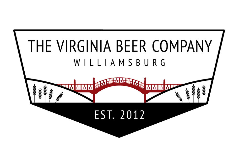
The first thing that jumped out about this new variation was that it combined the proposed focal image of the logo, the Crim Dell Bridge, with the name and location of the brewery. In prior iterations we had focused on having the name within the Deadrise outline and placing the supporting logo imagery elsewhere. This combination, with a sharper, slimmer font and a primary image not as large as Virginia’s silhouette, allowed for both to be combined into one space. Plus the iconography of the Crim Dell resonated with us! It was a reference to a landmark on William & Mary’s campus, tucked away with it’s own set of local folklore to play off of if we so chose. We liked the idea of this image symbolizing our own W&M trappings but also “bridging the gap” between beer drinkers from all over. Williamsburg has roots in big beer and small, and it is our goal to bring those roots together under one appreciation for great beer! We also enjoyed the openness of the design; this would allow us to add secondary images as needed, such as wreaths for a December Wassail or the Richmond skyline for our eventual releases in RVA. Adding the location of the brewery was a nice promotion of our college town establishment and good advertising for new markets we would venture into.
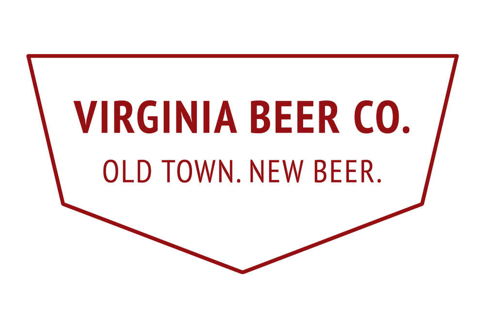
We decided that we still liked the idea of having some form of a logo that included the outline of the state where we were placing our hopes and dreams to create the next great craft brewing outpost. Once we came to terms with a primary logo, we worked with our artist to develop a new logo for use on secondary materials/promotion that incorporated the Old Dominon’s outline (including the Eastern Shore!) but still highlighted where our company would be located and brewing. The combination of a new primary logo, a secondary logo displaying the Commonwealth so proudly promoted in our name, and a clever tag line (Old Town. New Beer.) made us feel like we had really bundled together at least the early stages of our future branding…
Of course, the adventure of opening a new business (brewery or otherwise) tends to be a long one with more than a few forks in the road. Our expectation was that we would be open in 2014, and in a location that turned out not to be our final landing spot. As our brewmaster made the move to Williamsburg and as we finally closed on a space in late 2014 (401!), our discussions about brand development continued to mature and refine themselves. As we finally began to formalize permanent, critical details about the future of our business – an address, recipes, equipment sizing, opening timeline, distribution plans – we also formalized critical details about what the themes of the brewery would be when The Virginia Beer Co. finally opens in Fall 2015.
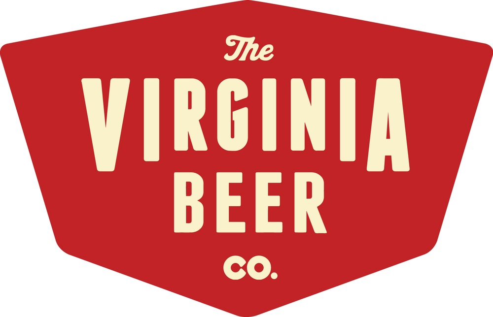
A new year and firmer direction brought with it some new motifs and one final iteration of our brand development. We are incredibly grateful to everyone who has been involved in the maturation of our brand imagery, a process (like every aspect of opening The Virginia Beer Company!) that has spanned more than three full years. And we in turn look forward to unveiling our final branding very soon.
Tune in for the next chapter of our pre-opening adventures in art (and stay tuned for more in our ongoing adventures in beer)!