As we’ve previously discussed, the road to finding the right design to compliment an idea for a new business is a long and colorful one. And this finale to our adventures in (company) branding is no different, so we hope you’ll bear with us for one more chapter… As entrepreneurs, Chris and I had spent years cultivating the notion to open a business in the beer industry. From there, we narrowed our focus to a brewery and taproom instead of a brewpub. We decided on a name, and then set our sites (pun intended) on Williamsburg, VA, home of the alma mater to me, Chris, and his wife, Erin. As our aspirations began to fill out a business plan, we had already gone through a number of iterations of what styles of logos we liked and how we wanted to represent our own brand in the form of words and images. From local help as far back as 2012 to professional support both near and far in 2013 & 2014, we had continued to refine our brand along the way.
As 2014 came to a close, we had accomplished much while we worked towards opening The Virginia Beer Company. We finally signed a lease for our building at 401 Second Street; we ordered equipment from DME; and we added a new full time member to our team when our brewmaster joined us. Surging into 2015, the conversation about how to establish and grow our new brand continued. We had new input from a new member of our team who had experience working in the craft brewing industry. We continued to take stock of all of the brewery openings going on around us. And we further discussed how best to utilize a name like The Virginia Beer Company.
A lengthy discussion about how to apply our brand to individual beers had also ensued during this time. Names? Images? Colors? So many aspects to consider to make a beer attractive not just in taste but in appearance and story as well. We conferred and decided that a bold primary image would allow us to focus on changing the color scheme of each of our flagship beers while keeping the overall logo the same image and format, thereby reinforcing brand recognition as we expand to new markets and add cans and bottles to shelves.
But what would that logo be? Would any of our previous iterations resonate with our future audiences? Outside of our home market, what if new consumers were not familiar with our William & Mary background? What story did we want our logo to tell on taps, bottles, and cans? The three of us agreed that it was important to call on our roots with our logo, but realized that doing so in a broad manner was important since our name encompasses an entire Commonwealth. Though it’s important to create a draw in our local market, our business goal is to expand the footprint of The Virginia Beer Co. to other markets within the state, and eventually to surrounding states and well beyond. How to accomplish both while staying true to our origins?
As we considered these topics and made crucial decisions about how we wanted to begin and grow our business, we were approached by an artist named Matt Leech. Matt is a Virginia based graphic designer who has done some previous work in the VA beer scene. When Matt got in touch he posed many of the questions about branding that we were already asking ourselves. And in addition he made a few recommendations that coincided with the business plan we were formulating not in 2012, 2013, or even 2014, but the one we were working on in 2015. Matt encouraged us to think simple when it came to our primary logo. After all, this image is going to be used everywhere: “Stickers, glassware, tap-handles, wax seal stamps, at the bottom of posters for events that you sponsor, the list goes on and on.” Matt reinforced the idea of simplifying our image so that wherever and whoever it is, people immediately know what to expect from our brewery.
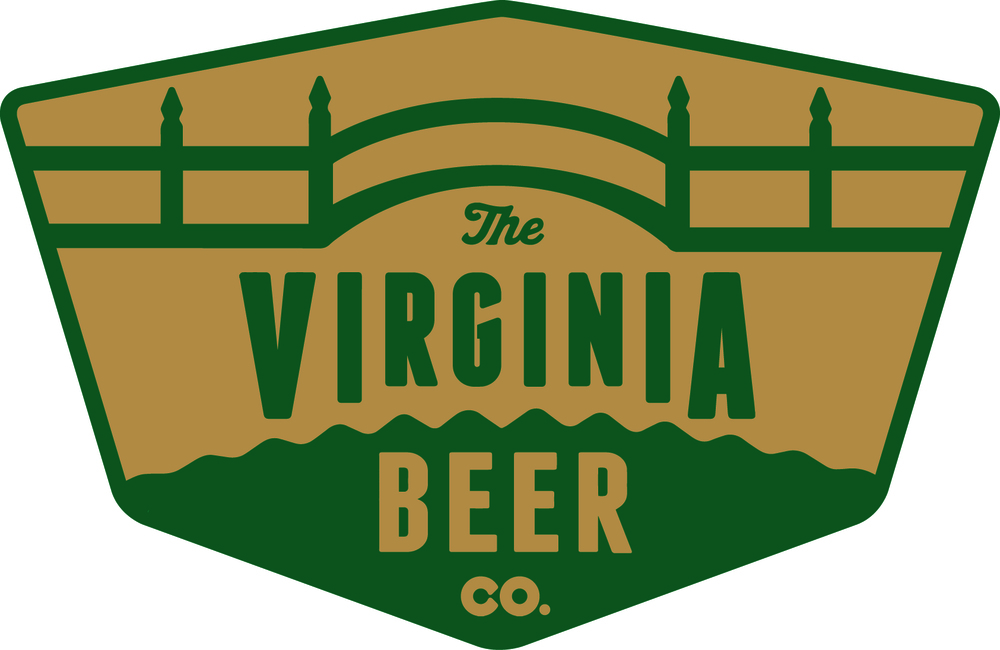
Working to open The Virginia Beer Co. for so long, and being William & Mary alums at that, the image of the Crim Dell Bridge really appealed to me and Chris. It’s interesting, it’s local, and it’s got a wonderfully unique construct. Something of note that Matt asked us to consider about our branding was to think about any image in a 1-inch square and answer the question, “Is it easily recognizable?” We all agreed that we will have plenty of opportunities to showcase more complex and symbolic imagery, but that there are many instances where that level of detail simply can’t or won’t be translated due to space, size, or physical display constraints.
Citing many of these concepts, we changed our primary focus to the Deadrise shape, bordering variations of the logo as far back as 2013. We all concurred that this is a powerful, unique shape that can easily be explained to anyone anywhere in the state and out. It’s not local, but it’s also not a well-known fact that it’s the state boat of Virginia, so there’s a great story behind the shape – one that really enticed us and that we believe can help to explain our story as The Virginia Beer Company. In terms of palette, we originally chose the shade of red we did because it is the actual color of the Crim Dell Bridge. It is also similar to the colors in the Williamsburg Color Collection from Benjamin Moore, a local shout out. We still liked the colors in that collection; they are more earthy and muted. Taking our shared feedback to heart, Matt worked in early 2015 to help us visualize a set of logos that we feel embody the vision for The Virginia Beer Company that Jonathan, Chris, and I had all come to share.
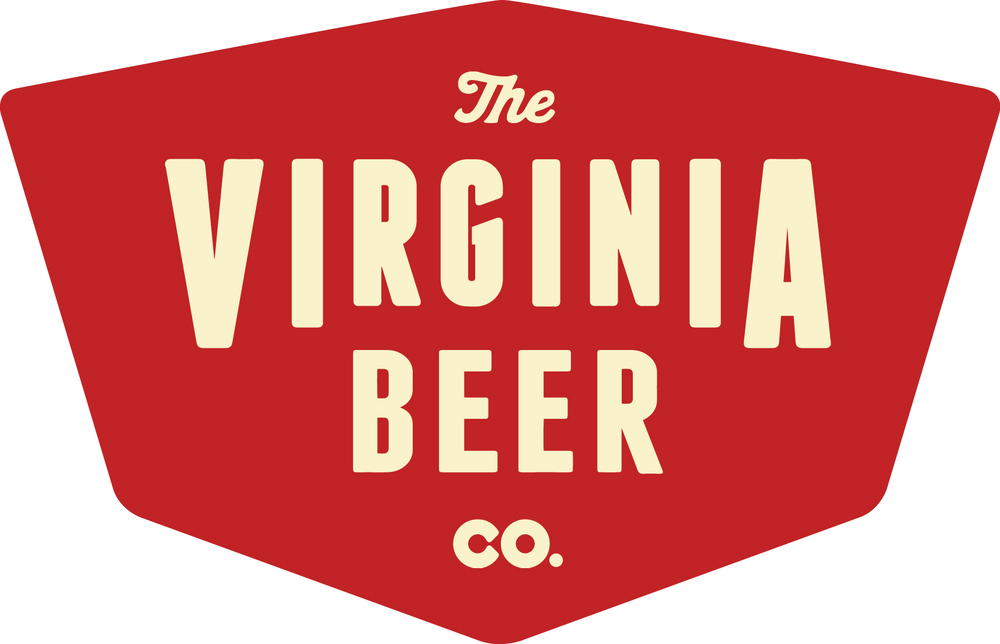
In addition to retaining many of our color schemes from previous iterations, we were thrilled that the inspiration for the type in the logo is the shape of the Crim Dell Bridge; the base of the word “Virginia” arcs over a flat top line of the word “Beer.” We still love that bridge and believe there is a place for it in our logos, and in our location. As we continue to make plans for our taproom and beer garden, it’s certain the Crim Dell will be prominently featured on site at 401! We also took to the tweak of the font to something that looked vintage. While we haven’t been open for a long time, we have been working to build the next great brewery for a long time. While we couldn’t express that in our established date, we felt we could express it in the style and boldness of our font. And we felt that the vintage look of the “shield logo” was a fitting homage to the history of our building! Specifically increasing the size and placement of the key points of the logo helped us to express the core of what we’re all about: Virginia Beer!
The other aspect of our brand we had been toying with was a slogan. We love the idea behind “Old Town. New Beer.” but felt it was a concept that could be centered around our taproom experience. While we have plans to eventually expand throughout Virginia and farther, we also want people to be excited about what’s going on in our taproom. The VBC taproom will be an experience in its own right, especially with Jonathan churning out experimental series on our 5 BBL pilot system! And this slogan seems like a perfect way to express that we are going to constantly have new beer in our taproom, located in one of the most historically old towns in America. It acknowledges the history-heavy identity of Virginia while having a forward-facing, modern mentality…exactly how we’d like to create the experience for visitors at 401!
For a global rallying cry, we considered: “For The Common Wealth!” When we asked Matt to incorporate this into some of our secondary logos, he did so after we all agreed to one update of the phrasing to: “For Our Common Wealth!” By changing “The” to “Our“, we feel we’re involving everyone in our cheer. After all, we are all coming together in the celebration of wonderful, Virginia beer. We knew it was important to pay homage to the State (or Commonwealth, as it were) of Virginia, especially with such an all-encompassing brewery name. And we knew we wanted to bring everyone together around what we expect to be a wonderful product in an already amazing industry. So this cheer fit the message we want to send with our beer, but we then realized that it may strike too close to another brewery, Commonwealth Brewing Company, which had recently opened in Virginia Beach. Back to the drawing board!

We look forward to us all raising a glass of Burg Beer together at 401 for our common wealth!
As we did when we settled on the name of the brewery, we decided to bring our theme back to its roots: for us, it’s all about people & place, beers & cheers. The Virginia Beer Company is meant to be a celebration of all the great people and all the great beers coming out of this great Commonwealth, and the business is meant to be a force for good in the Williamsburg community. To simplify these mantras, simply: “Cheers from Williamsburg, Virginia!”
The end result is a logo featuring state, local, and place imagery, with a focus on the core passion we have for the Williamsburg community and the business of beer. We continue to think critically about how important our current location, our backgrounds at William & Mary, and our coming years of expansion as a business are when it comes to what we plan to showcase in our logo. Craft beer is already a very stylish industry! Beer is inherently artistic from the amazing colors that various styles of beer promote to the many types of serving vessels into which these beers are poured. Packaging, tap handles, and merchandise combine forces to turn each brewery into a thriving, organic, beverage palette; and when done right, a brewery’s brand can entice not just the taste buds, but many of the other senses as well.
We can’t express our thanks enough to all those who have had a hand in helping us visualize our brand. From the volunteers to the professionals to the many who have offered feedback and asked questions, each of you has had a hand in developing who we are as a brand and what we plan to offer as a brewery. We wouldn’t be where we are today without everyone’s involvement along the way. And we look forward to moving forward with our brand, both in the beers we brew, and the experience we offer in our taproom and beyond. It’s going to be a lot fun! We’re stoked to have all of you along for the ride with us; and we look forward to raising a glass (or three) together For Our Common Wealth!
In other words, CHEERS FROM WILLIAMSBURG, VIRGINIA!
